Communicating ideas effectively to another person needs a common language, and a common understanding of the meaning of the symbols used in the language. While this sounds simple, language can take many forms including images, sounds and writing. This post is going to focus on the design and use of images as the language for communication.
The use of images as a language stretches back to the Ancient Egyptians. They developed a written language based on stylised pictures whereas the civilisations in the ‘fertile crescent’ developed cuneiform text.
Whist we may not be able to read the Egyptian script, many of these hieroglyphs are easily understandable.
Whereas the cuneiform script is completely indecipherable. However, just because we can identify a goose at the top of the third column of the hieroglyphs, it does not mean we understand its meaning!
A simplified graphical language can provide a really useful way of communicating complex information but when you use the language, you need to be sure the people you are communicating with have the same level of understanding you do and ‘see’ the same message.
One of the first attempts to stylise complex information and to make it accessible and easy to understand was the development of the London Underground map.
The London Underground Map
The London Underground is one of the most complicated systems in the world. By the middle of the 20th century the map was becoming too complicated for easy use.
The concept of the topological map we all know and use was developed by Henry Charles Beck. ‘Harry’ Beck was an English engineering draftsman at the London Underground Signals Office. He developed the first ‘topological map’ in his spare time, based on an electrical wiring diagram.
London Underground was initially sceptical of Beck’s radical proposal and tentatively introduced to the public in a small pamphlet in 1933. It immediately became popular, and the Underground has used topological maps to illustrate the network ever since. There is even a book on the map: Ken Garland’s, Mr Beck’s Underground Map (Capital Transport Publishing 1994). The book describes the enormous care, craft, thought, and hard work of Harry Beck that went on for decades (exactly what it takes to do great information design).
This style of communication has carried through to modern times but is not without its problems – you can easily get to the station you want, but there is no indication of how close or how far apart different stations are ‘on the surface’ – particularly if the stations are on different lines.
Success is contagious; most transport maps world-wide follow Henry Beck’s lead and a new universal language has been created.
The Melbourne map uses the same style as the underground map – lines are vertical horizontal or at 45 degrees, but unlike the underground stations, tram stops are not shown; the designers believe the street names and route numbers are more important.
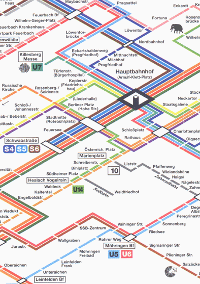
Based on your knowledge of the London or Melbourne maps, you do not need to be able to read German to have a good idea how to navigate the Stuttgart metro from the Hauptbahnhof to the Zoo. The language of transport maps has become fairly standard world-wide.
However, design of the communication is still important; the designers of each map need to decide what is important (eg, the route numbers on the tram map), what is emphasised, what is suppressed, and what is left out – bad design can reduce the elegance of the communication and block understanding. Whereas innovation can enhance it – the Tokyo train system has its trains painted the same colour as the line used on the transport map – the orange trains follow the orange route and you ret to the right platform by following the orange signs!
A similar convergence of communication style has occurred with in-car road maps. Most books and electronic sat-nav systems use a stylised language similar to the map of North Sydney (below) – another language designed for a specific purpose.
For the purpose of navigating a car to the ‘Aiki Kunren Dojo’, this ‘simplified road map’ is far more useful than the 100% accurate photograph of the same location!
The style of the road map above has been taken ‘virtual’ and global by several organisations including Tomtom. You do not need to be able to read the street names or understand the spoken advice ‘turn left in ……’ to follow the map – the pictures say it all and are just as effective in Shanghai and Munich as Sydney or Melbourne.
When designing a graphical communication language, useful, accurate and fully detailed are not synonymous! Both of the mapping languages discussed so far are really simple to use provided you have learned to ‘read the language’ and interpret them correctly. But as we all know North Sydney looks like the Google Earth photograph (not the map) and Melbourne’s geography only has a passing resemblance to the tram map – but we have learned how to read the ‘language’ and can then use that knowledge of the language to understand similar maps in different cities.
Project Maps
The same challenge applies to project dashboards, reports, and artefacts such as bar charts and CPM diagrams. Creating an appropriate level of understanding in a person’s mind about the true situation of the project and your intended work plans requires appropriate information to be communicated in a language that is understandable to the stakeholder. In this context, ‘appropriate’ does not mean complete or fully detailed; selecting the right level of detail is in itself an art form. The bar chart below may be fully detailed and precise but it is not a good communication tool!
And while preferred by many project controls professionals, the CPM logic diagram below is even less likely to work as a communication tool for stakeholders.
These specialist languages are useful to trained project controls professionals and some experienced project management professionals but are too complex for most communication needs.
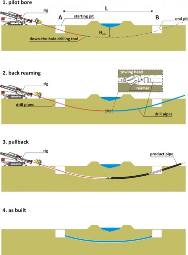
As suggested above, effective communication does not need fully detailed or accurate representation. What is needed is ‘useful’ information that can be used! You do not need to be an expert in directional boring to understand the plan for this project (all that is missing is the timing for each stage):
Simple is good, simplistic is dangerous! One of the popular options for reporting project status is using simplistic ‘red-amber-green’ (RAG) traffic lights such as these:
We know there is a scope problem but there is no real indication of the seriousness of the situation or how far into the ‘red zone’ the project actually is. Rather than the simplistic 3 point RAG scale, the same information can be displayed using more insightful tools:
Any of the ‘gauges’ will tell you where within each band the project is situated, add in a simple ‘change’ report and the trend becomes apparent as well. The art is knowing how much information is enough.
Conclusion
From the hieroglyphs of the Ancient Egyptians to the Tomtom road map, the art of using pictures for effective communication is creating a set of symbols that communicate your ideas and information simply and accurately, and then taking the time to teach your stakeholders how to read the language.
Effective communication, focused on obtaining the understanding and buy-in from a stakeholder needed to deliver a successful project requires:
- Understanding who are the key stakeholders at ‘this point in time’ that you need to influence;
- Understanding their needs and the best way to communicate with them (the Stakeholder Circle® methodology is designed for this purpose);
- Communicating the appropriate amount of information in a way that can be understood by the stakeholder; and then,
- Taking the time to help the person reach a proper understanding.
The communication challenge is recognising that some concepts will be easy to communicate in some communities of stakeholders, others will be more difficult; and people are frightened of things they don’t understand.
Designing an effective communication strategy requires the project team and project leaders to firstly derive a common understanding between themselves, then determine what the key stakeholders actually understand, then determine how to communicate effectively with the key stakeholders to build their understanding to the level needed to get the ‘buy-in’ required to make the project successful.
Effective communication is the tool that builds understanding, reduces opposition based in ‘fear of the unknown’ and generates a framework for success – for more on effective communication see: http://www.mosaicprojects.com.au/PM-Knowledge_Index.html#PPM07


 Posted by Lynda Bourne
